Case studies
Otterbourne Summer Festival 2024
I led the marketing for this new event (and am currently working on the 2025 designs).
Historically, St Matthew’s has run a very successful summer event (originally known as the Otterbourne Village Fete and Jalopies) which had been the church’s biggest fundraiser. However, the team behind it decided it was time to hang up their fundraising aprons so a small group of us volunteered to take it on, but felt it was time for a revamp.
Instead of a traditional village fete, we opted for a new format – a festival. There were two stages showcasing a wonderful variety of local music and dance acts, along with plenty of other activites including Inflataplanet, a local farm, acrobatics, and local food and drink.
We felt a lot of pressure to make this event successful, given the reliance on the fundraising, so it was vital the marketing was done well. The campaign included:
- creating an event on Facebook (which 957 people responded to)
- scheduled Facebook posts (daily in the week leading up to the event tagging acts / suppliers and encouraging them to share the posts)
- posters / flyers
- advert in local magazine
- advertising banner for estate agent boards
- 3m x 1m vinyl banner
For the event itself, I also designed a DL programme (which included a festival map I created in illustrator), raffle prizes poster and an entrance sign, all in the same bright, summery, eye-catching colour scheme.


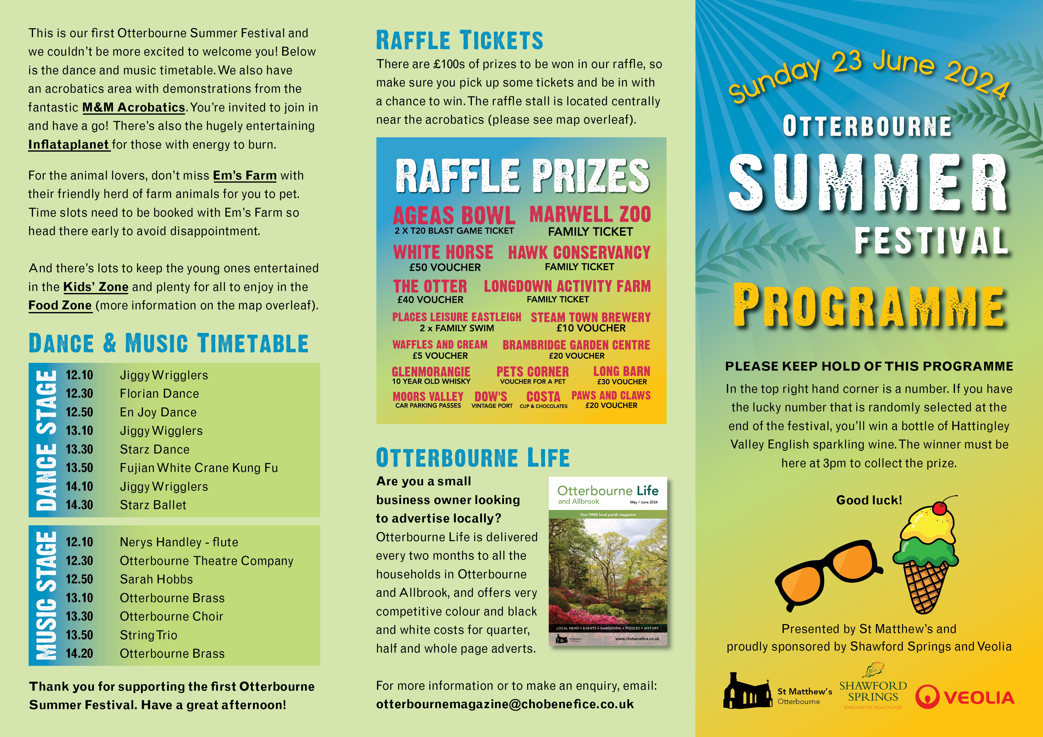


The day itself was a huge success and raised a fantastic £6,000. We were slightly overwhelmed with how popular it was actually. The BBQ completely sold out within the first two hours, as did the cake stall and coconut shy, so we’ll know to adjust our provisions for next time!
Build Instagram following
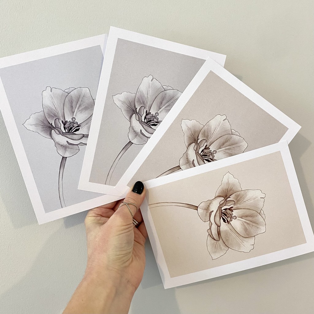
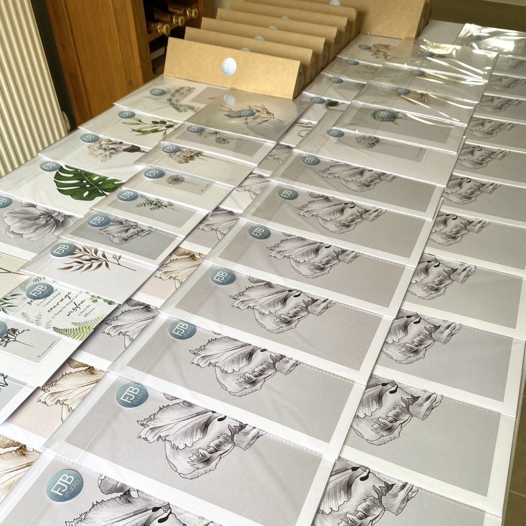
The most effective way to build Florio Bay’s Instagram following was through giveaways – offering the chance to win a bundle of home goodies in return for a like, follow, tag and a share.
During November 2023, I led and designed a “Christmas Decor Giveaway” with four other small businesses who sold items that complimented my neutral watercolour prints. It attracted a lot of attention and we all gained hundreds of new followers.
Prior to this, I led a giveaway to mark reaching 5k followers. I reached out to ‘Photo Frames and Art’, one of the leading frame shops in the UK and the shop I always recommend to my customers to buy their frames. I asked if they’d be happy to collaborate with me on a giveaway, and to my delight they said yes.
We offered one lucky follower the chance of winning four of their best-selling “oversized mount” frames, in a finish of their choice, along with a set of four of my watercolour prints, again of their choice. This was a very popular giveaway!
Collaborate with influencers
I have worked with a number of very successful home account influencers on Instagram. One of my favourites is @home_on_the_commons. She has a following of 390k and has a real knack for selling!
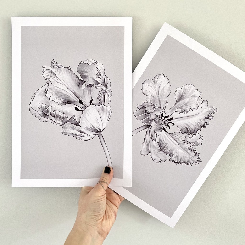
When she announced she was redecorating her bathroom, I immediately saw an opportunity to get my art on her freshly painted walls so I messaged her, offering to paint a new set of prints in return for her to promote it on her account through a reel and stories. She was very happy to collaborate and suggested a subject and colourway that would work in her bathroom. The result was a set of two tulip prints which have become one of my best-selling sets.


Rebrand Test Valley Borough Council
I led the redesign of the Council’s corporate identity.
The logo – the central and most powerful element of the corporate identity. I drafted four different options that were presented to the Councillors. A favourite design was chosen, and a few revisions suggested (mostly tweaking the trout to make it look less like a “dolphin”) before the final design was adopted.
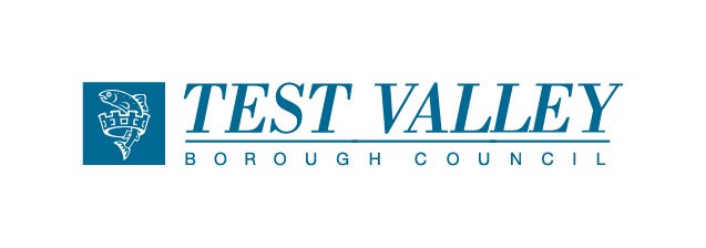
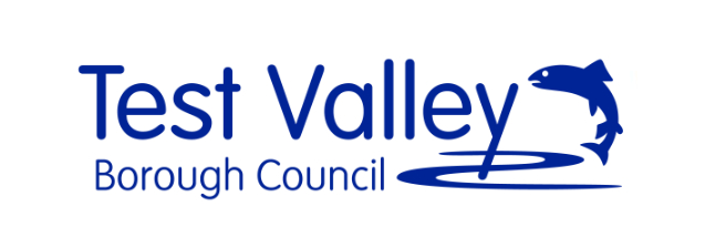
Above: old logo left, new logo right.
The design uses a modern sans serif font. It is coloured blue to reflect the River Test which runs through the heart of the borough. The River Test is a famous chalkstream well-known for its trout fishing.
To ensure the logo is used consistently across all Council communications, I produced a set of corporate identity brand guidelines. These guidelines give very specific instructions about the use of the logo (exclusion zones, positioning, size, margins, colour, typefaces etc) and also explains how other visual elements should be used to reflect the Council’s vision, values and aims.